


Color Psychology in Marketing: A Guide to Choosing Brand Colors
Introduction:
Color is an important part of how a brand appears and communicates, but it does not work separately from the message, design, culture, audience, and industry context. A consistent and readable color palette can help make a visual identity clearer across websites, social media, and printed materials.
This guide explains color psychology, explores common color associations, and shows how Nourline develops a brand palette that fits the brand personality and target audience.
🧠 What is Color Psychology?
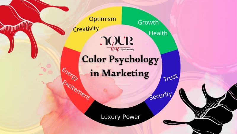
Color psychology explores the associations and impressions people may form when they see certain colors. These associations are not universal rules; they can vary by culture, context, audience, color combination, and use. For branding, color meanings are a starting point that should be connected to positioning and audience research.
Common Color Associations in Branding
- Red may communicate energy, passion, or boldness, but its effect depends on the shade and context.
- Blue is often used to suggest trust, reliability, and calmness, especially in service and technology industries, but it still needs to differentiate the brand.
- Green may support messages of growth, health, and nature, although the meaning changes with the industry, shade, and combination.
- Black can suggest luxury, power, or simplicity, but it needs balance so the design does not become heavy or difficult to read.
- Yellow may add optimism, energy, and attention, but large areas and text require careful contrast testing.
- Orange may communicate vitality, friendliness, and creativity, making it suitable for brands that want an energetic and approachable tone.
How Can Color Support Your Brand?
Consistent and relevant color use can support brand recognition and visual clarity, but business results do not come from color alone. Engagement and sales also depend on the offer, content, user experience, accessibility, and quality of the product or service.
How Nourline Develops Brand Colors
At Nourline, we begin by understanding the brand personality, business objective, and target audience. We then review competitors and the visual context of the market. Next, we create a palette with primary, supporting, and contrast colors, and test how it works across websites, social media, and print applications.
We also review readability and contrast so the visual identity can be clearer and more accessible to a wider audience. If you need a complete digital presence, explore [website design services](https://nourline.com/website-design/) or [digital marketing services](https://nourline.com/digital-marketing-3/).
Examples of Our Work
ArtStep: We developed a calm and professional visual direction aligned with the company’s services and designed to present the brand more consistently.
Kayan: We created a strong and structured visual direction that reflects the safety systems sector and supports brand clarity across marketing materials.
Add measurable results only when they are documented with a timeframe and measurement method.
Ready to Choose Your Brand Colors?
Nourline can help you build a palette that fits your brand personality and audience, then apply it consistently and readably across your key touchpoints.
Tell us about your brand and book a consultation to choose your visual identity colors.
Frequently Asked Questions (FAQs)
No. Color associations can vary by culture, context, industry, age, and personal experience. Research and design testing are more reliable than using one fixed meaning.
Define the brand personality, audience, and message; review competitors; build a balanced palette; and test it across the applications where the identity will appear.
No. Color can support clarity, perception, and consistency, but sales also depend on the offer, content, user experience, service quality, and audience fit.
Yes. Text, buttons, and important interface elements should be tested for readable contrast according to the platform and relevant accessibility guidance.